IPCC Working Group 1- Summary for Policy Makers
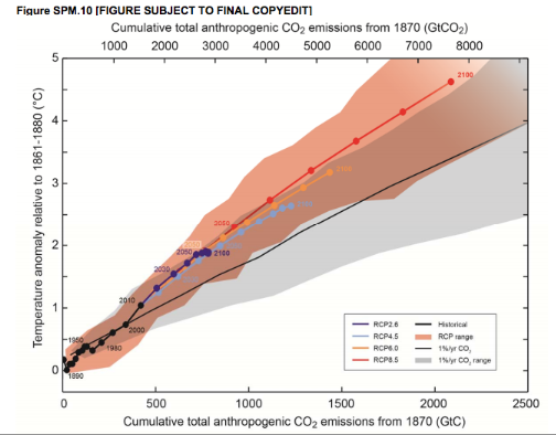
Here's a graph from the IPCC WG1 SPM, as the above-referenced report is known for short, showing total cumulative carbon dioxide emisssions since 1870 in gigatons of carbon on the X axis and temperature anomoly above preindustrial levels on the Y axis.
The "business as usual" scenario of RCP8.5 shown as the red line in the above figure from is based on hitting a carbon dioxide level of 1313 parts per million of carbon dioxide equivalent (carbon dioxide plus other greenhouse gases including methane, Nitrous Oxide, HFCs, NOx, CO, NMVOC) by 2100.
This scenario is in line with other studies, such as the MIT Energy and Climate Outlook 2012, which projects around 5° Celsius (9° Fahrenheit) global average increase in temperature by 2100 above pre-industrial levels should we continue releasing these heat-trapping gases as if there were no tomorrow.
The caption from this figure in the report reads:
Figure SPM.10: Global mean surface temperature increase as a function of cumulative total global CO2 emissions from various lines of evidence. Multi-model results from a hierarchy of climate-carbon cycle models for each RCP until 2100 are shown with coloured lines and decadal means (dots). Some decadal means are indicated for clarity (e.g., 2050 indicating the decade 2041−2050). Model results over the historical period (1860–2010) are indicated in black. The coloured plume illustrates the multi-model spread over the four RCP scenarios and fades with the decreasing number of available models in RCP8.5. The multi-model mean and range simulated by CMIP5 models, forced by a CO2 increase of 1% per year (1% per year CO2 simulations), is given by the thin black line and grey area. For a specific amount of cumulative CO2 emissions, the 1% per year CO2 simulations exhibit lower warming than those driven by RCPs, which include additional non-CO2 drivers. All values are given relative to the 1861−1880 base period. Decadal averages are connected by straight lines.
